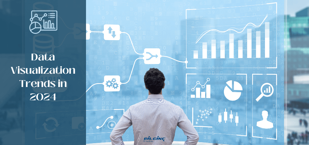
The art and science of turning raw data into meaningful insights have never been more crucial! In this era of unprecedented data growth, the ability to not only understand but also effectively communicate these insights becomes paramount. The year 2024 stands at the forefront of this evolution, witnessing an array of emerging trends in data visualization that promise to redefine how we interact with and interpret data.
This blog post aims to guide you through these pioneering trends in data visualization. From immersive 3D data landscapes to AI-driven visualization tools, we will explore how these advancements are not just changing the landscape of data analysis but also enhancing our ability to make informed decisions in a data-driven world.
The landscape of data visualization has seen remarkable transformations in the past few years, driven by both technological advancements and an ever-growing demand for data-driven insights.
Before jumping into the trends, if you want to learn more about data visualization, you can read this informative article: Communicating with Data: Visualization.
Let’s take a retrospective journey to understand the trends that have shaped the field:
Gone are the days of static charts and graphs. Recent years have witnessed a surge in interactive visualizations, enabling users to explore data in a dynamic and engaging manner. This trend has empowered decision-makers and analysts to delve deeper into the data, uncovering nuanced insights.
AR and VR technologies have taken data visualization to new dimensions, literally. These technologies allow for immersive data experiences, making complex data more accessible and understandable through a three-dimensional perspective.
Artificial Intelligence has played a crucial role in automating the process of data visualization, offering predictive insights and patterns that might be overlooked by human analysts. This trend has significantly enhanced the efficiency and depth of data analysis.
With the ubiquity of smartphones, there has been a shift towards designing data visualizations with a mobile-first approach. This trend acknowledges the need for accessible, on-the-go data analysis, catering to a mobile audience.
With the growing concern over data privacy, the recent trend has been towards more ethical visualization practices. This includes being transparent about data sources and ensuring that visualizations do not mislead or misrepresent the data.
These trends have not only enhanced the way we visualize data but have also broadened the scope of what can be achieved through effective data presentation. As we look towards 2024, the foundation set by these trends paves the way for further innovation and advancement in the field of data visualization.
As we venture into 2024, the data visualization landscape is evolving rapidly, introducing innovative trends that redefine how we interpret and interact with data. Here's a glimpse into the future of data visualization:
AI is revolutionizing data visualization by creating more intelligent, insightful visual representations.
AI-driven data visualizations are increasingly pivotal in extracting and presenting complex insights from vast data sets. These advanced visualizations utilize machine learning algorithms to identify patterns, trends, and anomalies that might be missed by human analysis. This approach significantly enhances decision-making processes, particularly in sectors like healthcare, where AI can predict patient health trends, or in business analytics, where it can forecast market behaviors. By automating and refining the visualization process, AI-driven tools are making data interpretation more efficient, accurate, and insightful.
AR and VR are enhancing data visualizations with immersive experiences, making complex data sets more tangible.
Data storytelling is becoming more sophisticated, weaving narratives that engage and inform audiences.
The ability to visualize data in real-time is critical for immediate decision-making.
Data visualization tools are focusing on customization, allowing users to tailor their data exploration.
The visualization of geographical and spatial data is gaining prominence for location-based insights.
Spatial data visualization is becoming increasingly vital due to its ability to convey complex geographic relationships in an intuitive format. It enhances decision-making in areas like urban planning and environmental management by making geographic data more accessible beyond GIS experts. The rise of IoT and big data has led to a surge in location-based data, and spatial visualization is key in interpreting this information, offering insights into trends such as population movements and traffic patterns.
Generative design uses algorithms to generate multiple visualization outputs, offering unique perspectives on data.
Gamification techniques are being applied to data analysis to make it more engaging and approachable.
Gamification in data analysis is gaining popularity as it transforms data interpretation into an engaging and interactive experience. Incorporating game-like elements increases user engagement, especially for non-experts, and enhances learning and retention of complex data concepts. It also encourages broader participation in data collection and analysis, particularly in community and social projects, leading to higher engagement and richer data sets.
As we embrace 2024, these trends signify a leap towards more interactive, insightful, and user-friendly ways of visualizing data. The future of data visualization not only promises enhanced clarity and engagement but also a deeper understanding of the stories hidden within our data.
For 2024, we shared our data visualization trend predictions with you. We are sure that there are some of them that interest you more and you want to start learning immediately. If you are ready to improve yourself with data visualization trainings, let's take a look at the best data visualization courses now.
Data Visualization tools offer a range of functionalities, from simple dashboarding to complex data analysis and visualization, catering to different business needs and skill levels. Here's a list of some of the most popular data visualization tools widely used in various industries:
As we have explored, the field of data visualization is rapidly evolving, propelled by advancements in technology and an ever-increasing emphasis on data-driven decision-making. From the transformative trends of recent years to the cutting-edge developments expected in 2024, it is clear that data visualization continues to play a critical role in how we comprehend and interact with the vast amounts of information that define our digital age. Tools like AI-driven visualizations, AR/VR integration, and gamification are not just enhancing our ability to represent data, but are also making it more accessible and engaging for diverse audiences.
As we look beyond 2024, the future of data visualization promises even greater integration of technology and creativity, driving forward our understanding and utilization of data in unprecedented ways. If you want to make a career in data visualization or advance in your career, Bilginç IT Academy's experienced trainers and award-winning training content are ready to help you! Contact us now and let us determine the right training for you. You can fill out the form on this page for your registration and questions.